The Nuremberg chronicle
February 2022
by Pooja Katti
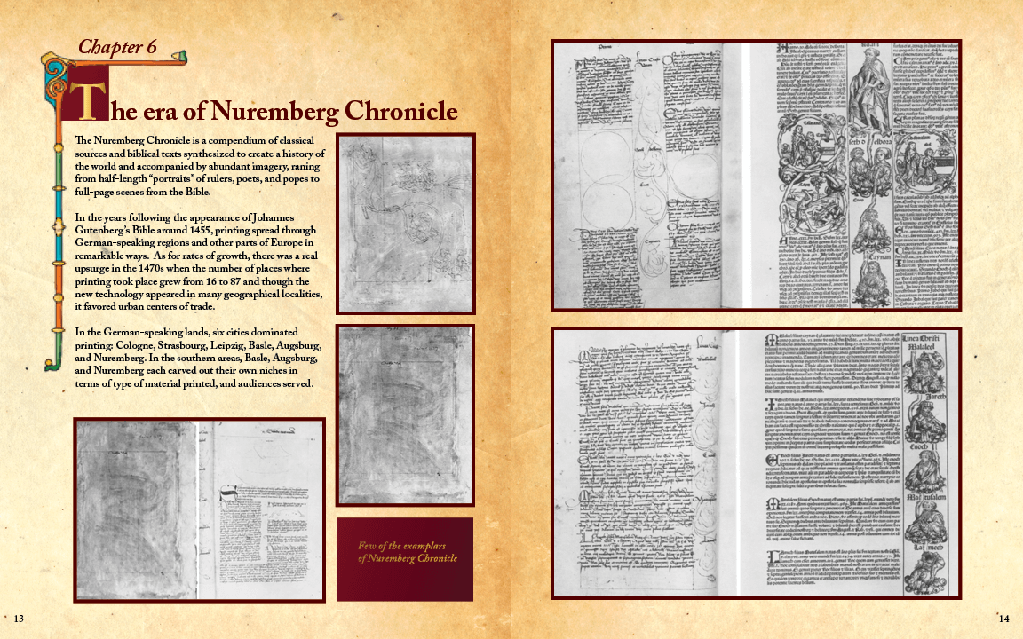
In the years following the appearance of Johannes Gutenberg's Bible around 1455, printing spread through German-speaking regions and other parts of Europe in remarkable ways. As for rates of growth, there was a real upsurge in the 1470s when the number of places where printing took place grew from 16 to 87 and though the new technology appeared in many geographical localities, it favored urban centers of trade. In the German-speaking lands, six cities dominated printing: Cologne, Strasbourg, Leipzig, Basle, Augsburg, and Nuremberg.
Aim: To study and highlight visual elements, grids and typography of the book, Nuremberg Chronicle.
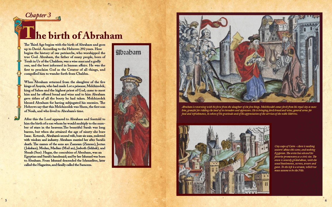
Brief: In addition to above study, the main chapters of the book was redesigned and recreated for modern times, by taking inspiration from olden style.
About the book
Patrons: Merchants Sebald Schreyer and Sebastian Kammermeister wanted to record the history of the world, from creation until their day, both in word and in design. In achieving such a printing feat, they hoped to bring great renown to their beloved city.
Artist: Local artists Michael Wolgemut and Wilhelm Pleydenwurff, who ran a respected workshop that specialized in book illustration and immediatly drafted a contract for the chronicle in 1487.
Prtinter: Anton Koberger, known as - “the quintessential merchant publisher”, belonged to a wealthy lineage. He had connection across the continent, He understood his audience and knew their likes and dislikes and printed books that would sell.
Writers: The patrons of the project also enrolled the help of
Dr. Hartmann Schedel, a member of the city's circle of humanists, who was asked to compile the text, in Latin.
The scribe Georg Alt was engaged to produce a translation from the Latin in to German, for a vernacular edition.
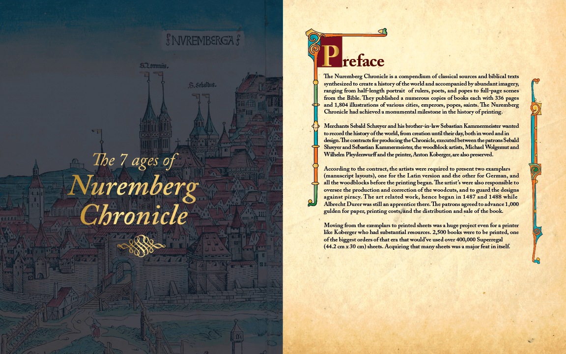
Art and design: According to the contract, the artists were required to present two examplars (manuscript layouts), one for the Latin version and the other for German, and all the woodblocks before the printing began. With about 2,500 copies, each with 336 pages and 1,804 illustrations of various cities, emperors, popes, saints, The Nuremberg Chronicle had achieved a mounmental milestone in the history of printing.

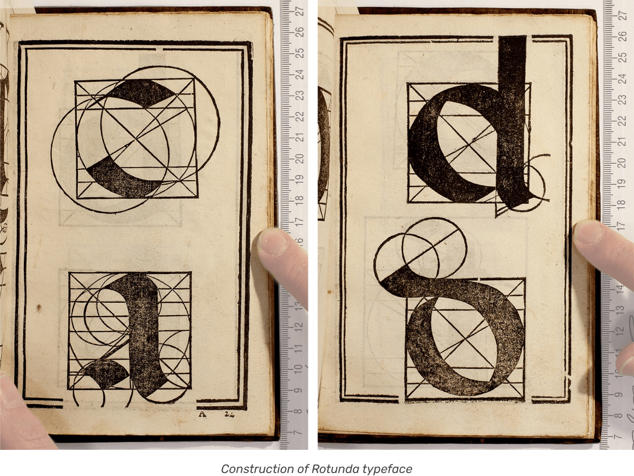
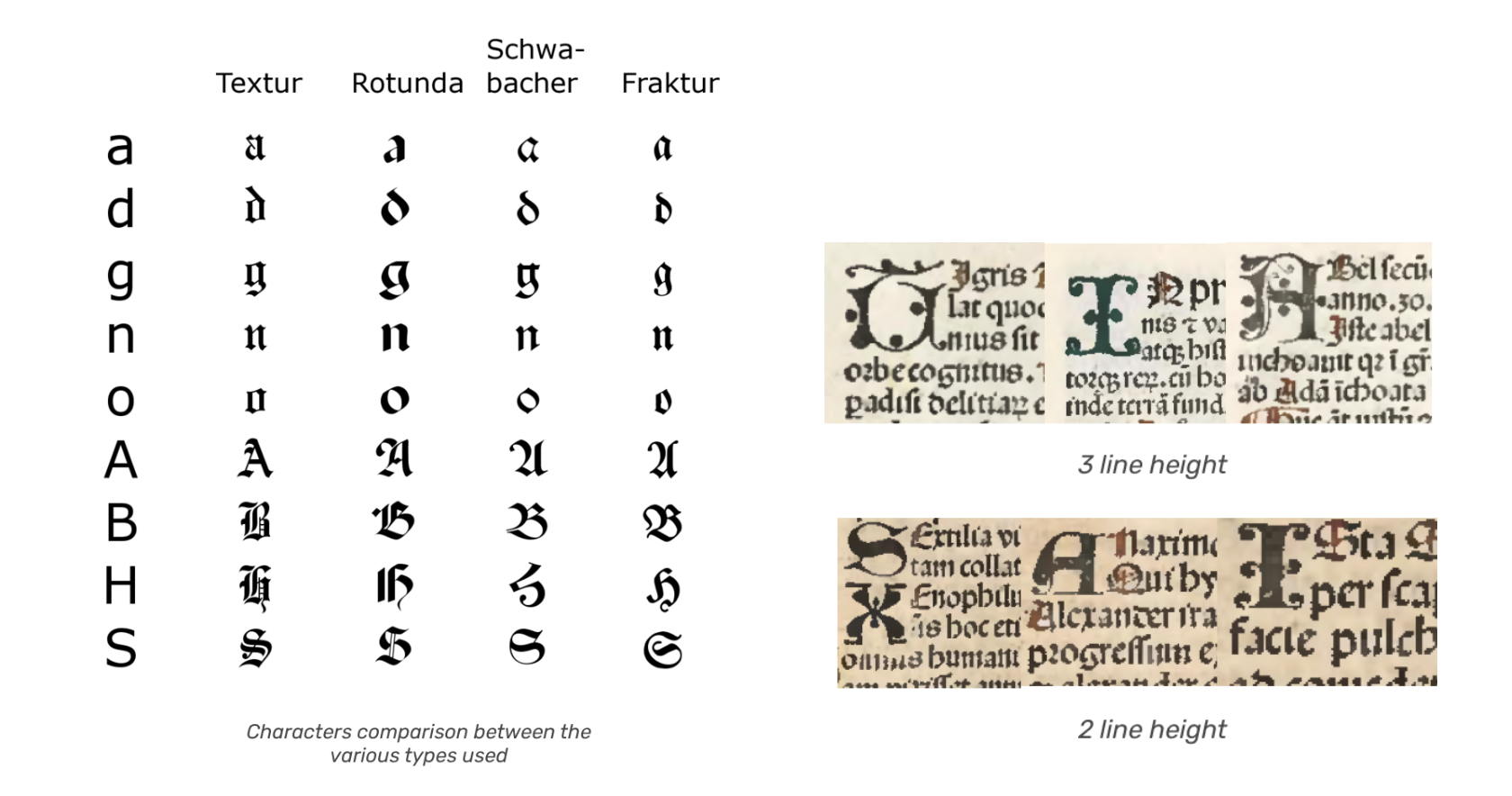
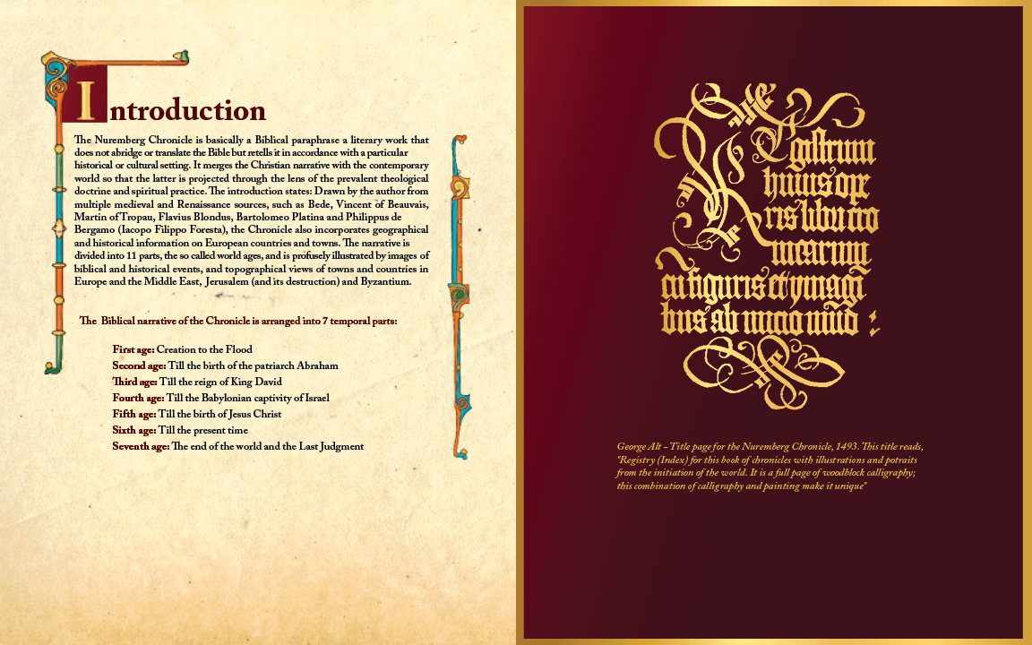
Typography: Koberger also was responsible for selecting typefaces that would be acceptable to the patrons; a Rotunda type was chosen for the Latin edition and a Schwabacher type was used for the German.
Larger versions are used for headings, and initials appear in a Lombardic font. It likely took 2 or 3 months to design, cut and cast the type.
Historians credit the book for being at the root of a subsequent custom for using different type for different languages (e.g. Roman for Latin texts and Fraktur for German)
The type of the headings (0.33 in.) is an Italian rotunda with ornamented capitals. The text type (0.2 in.) in the same style, though with plain capitals, was cut specially for this book. There are Lombardic initials of two sizes, 3-line and 2-line.
Elements of typography
Construction: Broken and interrupted.
Shape: Combination of curves and straight lines, angular treatment for constructing curves. upright stems are made with concave and convex elements.
Proportion: Roman square capital proportions.
Modelling: High contrast with thickest and thinnest parts of letterform. Axis of contrast - angled.
Weight: Medium, black colour.
Terminations: Variety of terminations found in the letterform.
Baseline: Beak stroke and hooked strokes, Tuscan (bifurcated), Characters such as o,a, have blunt strokes and characters like r,s f have earlobe strokes.
Key Features: Double storey characters, concave apex in characters, characters descending below the baseline, oblique cross-bar in characters, horizontal spur.
Basic Style:Seems calligraphic, concept of ink traps was found here.
Layout grids
The exemplars were utilised to determine the spacing between all page elements and to define grids before moving on with printing. The book was meant to house more than 1800 illustrations and a lot of text, which demanded prior planning and testing.
Illustrations
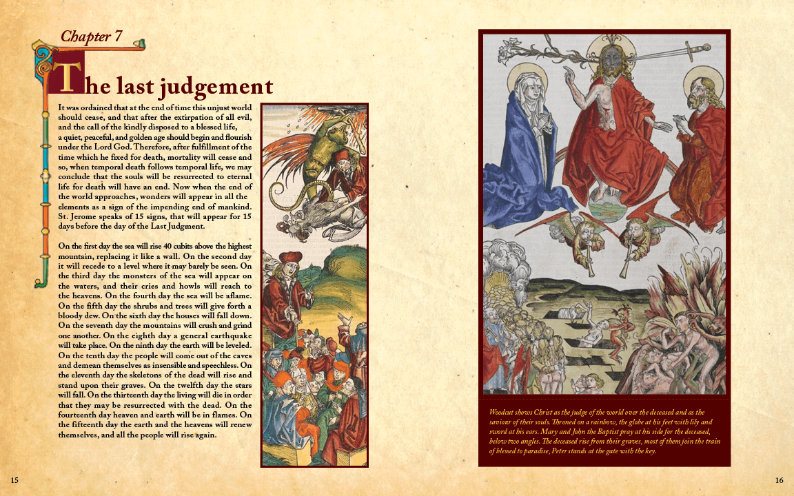
Apart from the texts, a remarkable feature of the Chronicle is its illustrative nature. After all, this was the most heavily illustrated book of the 15th century. A considerable amount of time, perhaps as much as 3 years, was spent creating the woodcuts.
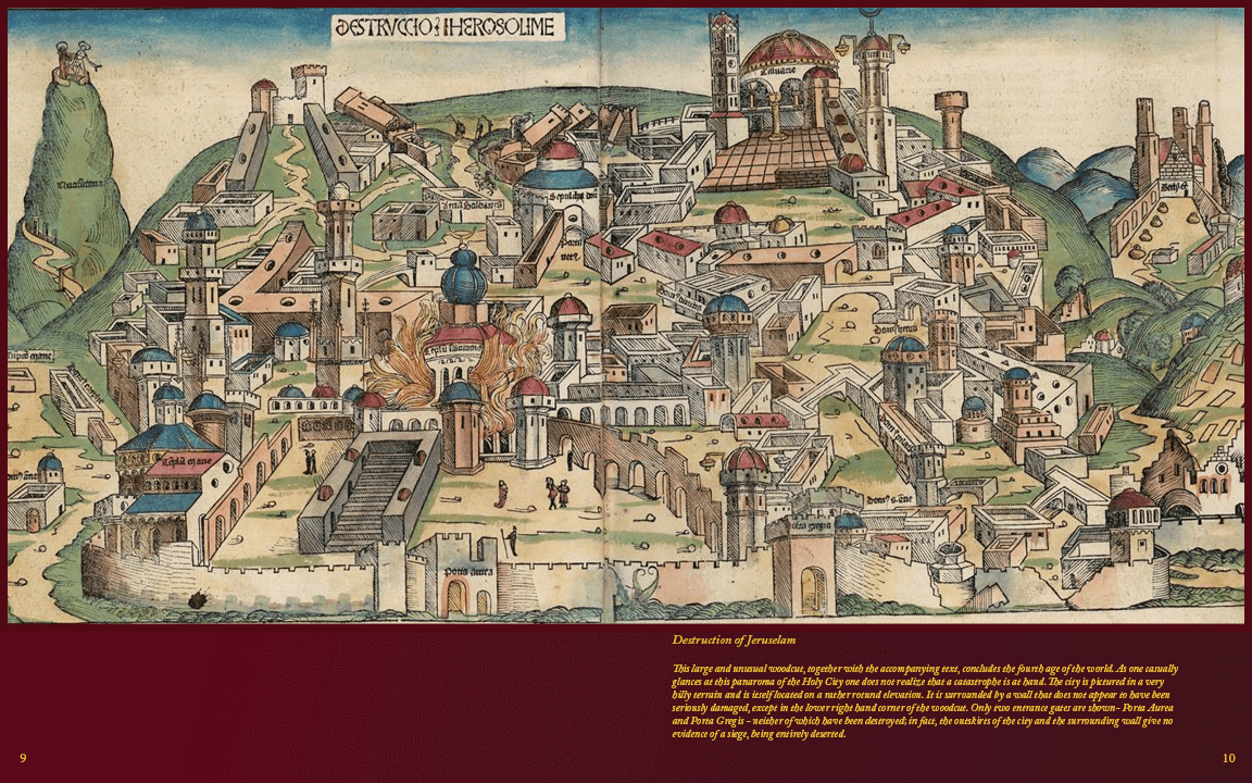
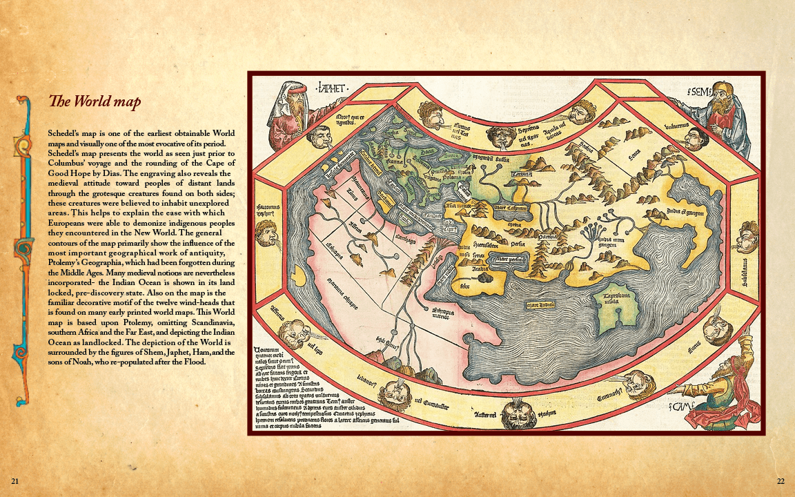
Altogether there are, incredibly, 1,804 illustrations, made from 652 woodblocks. The numbers here tell us that on occasion blocks were used more than once in the book to depict multiple people and places. For example, 53 cuts were used to represent 101 different cities and countries, and only 96 cuts represent 593 different saints, popes, kings, and scholars.
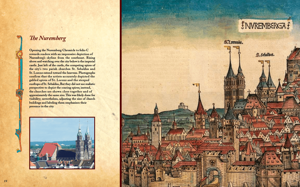
Some of the city views were based on observation, others on models from books in Schedel’s library.


Reference
The Early Drawings for the Nuremberg Chronicle • JSTOR
The Nuremberg Chronicle • The Duke
Hartmann Schedel Publishes "The Nuremberg Chronicle," the Most Extensively Illustrated Printed Book of the 15th Century
Never Before Has Your Like Been Printed: The Nuremberg Chronicle of 1493 • The Printing of the Nuremberg Chronicle: Background, Production, Legacy
Nuremberg Chronicle (Inc.0.A.7.2[888]) • University of Cambridge
The Nuremberg Chronicle • Wikipedia


